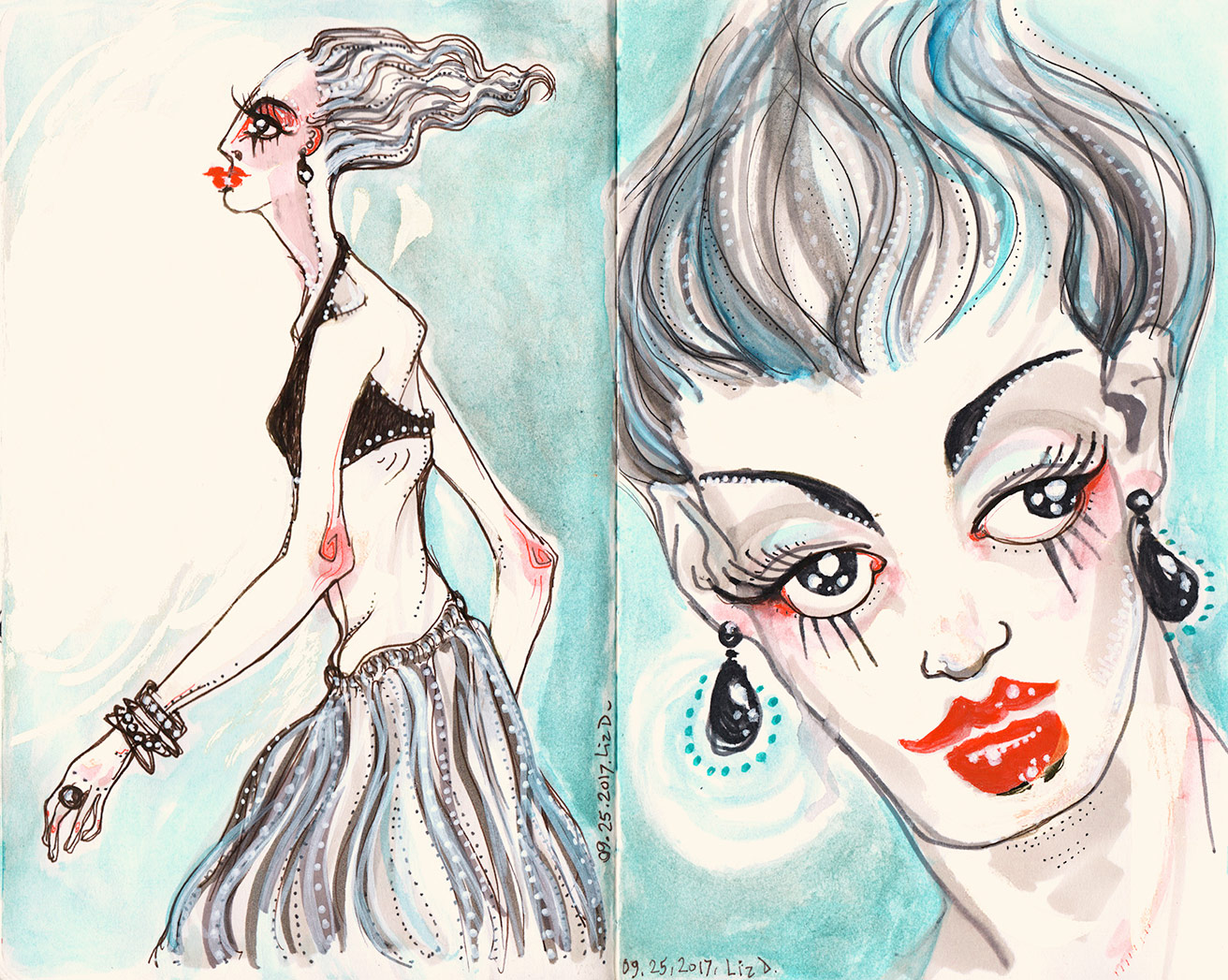
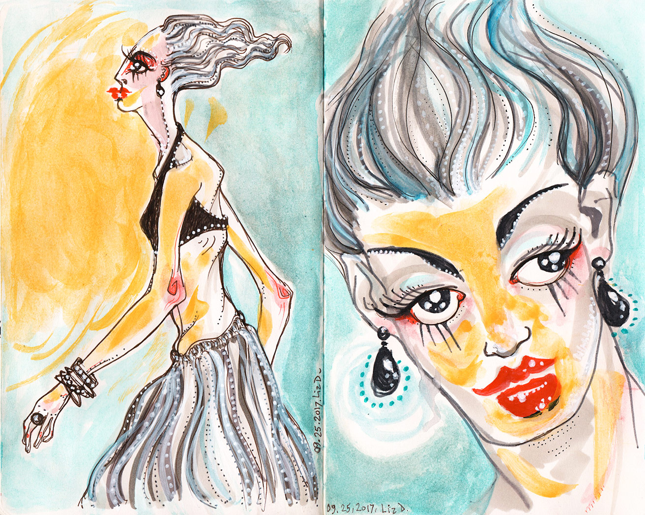
 These went through many stages, and in retrospect I think the yellow glow in the final (below) went too far, although I sort of like the contrast it adds. But I love monochrome, and when it was all just the blues, greys and pops of red, it was stronger.
Also, with the yellow added, it lost its fine balance of negative space, because that yellow is so intense— it’s a thing! Definitely more particle than wave, as far as light goes.
It’s always about EDITING!

Beautiful work – you vision is unique.
Thanks for sharing.
Thank you so much!
these are good….. very good…..liked them…
Thanks so much, and thanks for visiting.
I LOVE this painting… I definitely agree with you about the golden/yellow glow being a little too far… I preferred it without, however it’s still beautiful either way… they’re almost separate pieces, both feel like a different tone almost, and I love both!
Thanks so much! They really do feel totally different, with the addition of that one color; I was trying to get an illusion of directional light, but it was too strong a yellow.