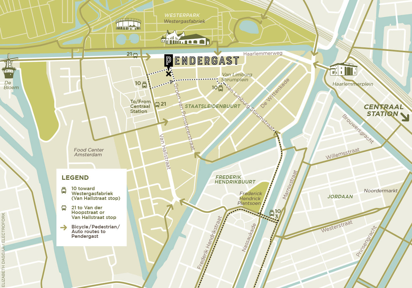
This map, which I designed / illustrated for Pendergast in Amsterdam, went live on their website a week or two ago. I worked with them to articulate entryways to the neighborhood, highlighting routes for cyclists, cars and public transport.
In the midst of designing, I traveled to Amsterdam. We held meetings. I went to the restaurant a number of times— on foot, cycling, and on the tram. As I already had a solid representation in my head of this neighborhood that I was physically unfamiliar with, I never had to consult Google. The map works.
Additionally, having spent time in the restaurant and experiencing several dinners there was instructional (and delicious). When I returned those firsthand experiences were invaluable in the final process of interpretation for style, for vibe.
The aim was for a map both useful and attractive, incorporating the restaurant’s branding without sacrificing usability. In the final phase we decided to add icons of major landmarks to further aid those new to the area. I’m happy to say we’re all pleased with it.
See more stylish maps here!
