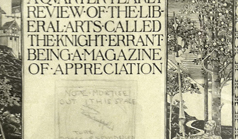
Last weekend I visited the Grolier Club to view the exhibition “Printing for Kingdom, Empire & Republic”. Although it was not part of the exhibition, above is part of a gorgeous cover design for a quarterly magazine which was framed in the basement (click to see full image). Although it is generally frowned upon these days, I have always loved this sort of extreme force-justification wherein words will be split up with little regard to legibility, the designer being more focused on arriving at a perfectly balanced block of letterforms. I wish I’d been able to get a sharper image of it; the engraving around the borders is detailed and fantastic.
The exhibit itself contained many beautiful and precisely-carved letter blocks, and in many alphabets (read languages), although some of the documentation left a lot to be desired (not enough information in some cases, and in others, rather too specific without much of a bigger picture). Alas, too, we had not enough time as there was a private event (a memorial for a recently deceased club member, so it had not been listed on the site) being set-up in the main gallery.

