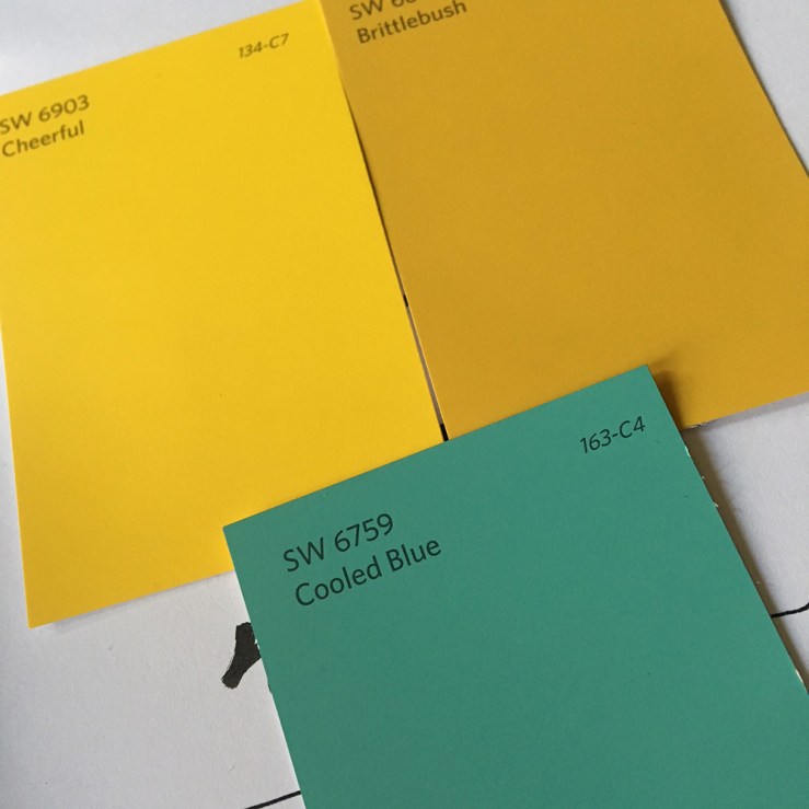
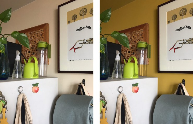
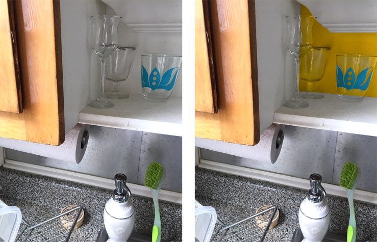
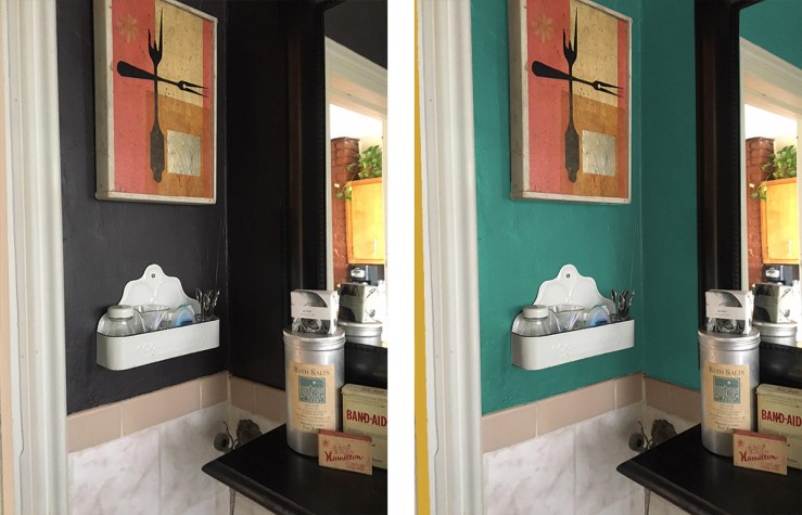
 It’s time for some updating and new colors. I’ve been thinking about some new colors for awhile, and went to browse the chips this afternoon.
 When I got home, I checked them all out in the rooms and against the light and existing paint, then gave them a quick run-through in Photoshop, as I can’t resist that sort of thing.
Two shades of yellow for the kitchen; a rustic sort of dark Naples yellow for the walls, with pops of a true, bright yellow (this tint named “Cheerful!”)
 I’ve rather always regretted how very subtle my choice was for the kitchen— looks barely a color in that West-facing room. Time to make right.
 This exuberant yellow will appear in two pops, on walls directly opposite one another— in the recessed shelves and on the double pantry doors. Can’t wait to see it up!
And in the teeny, tiny bathroom (which has done really well in a nearly-black brown color for 7 years now) shall be updated with a color pulled from a couple of the tchotchkes in there, eg. the bath salts tin— a sort of burnished aqua tone.
I’m hoping that it will make the awful dusty-rose tiles appear more neutral, and disappear in its high-key presence. Distraction is often a key component— a designer’s sleight-of-hand.

Nice.