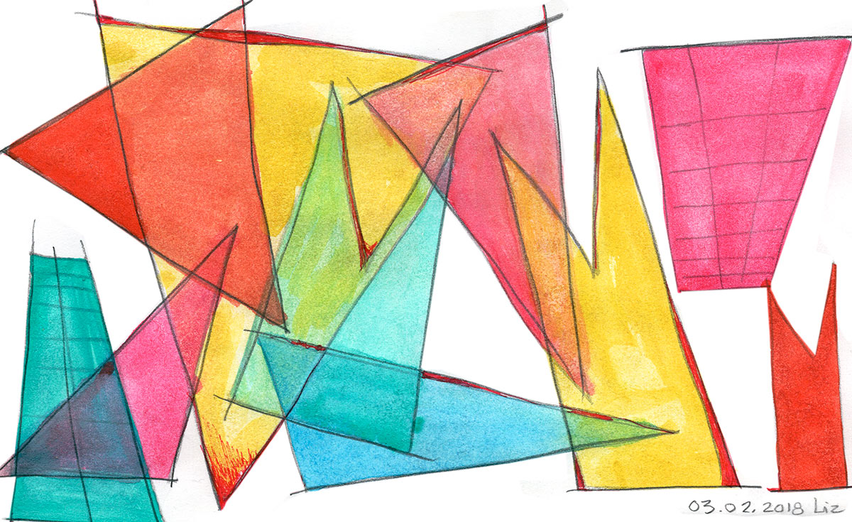
Here are a couple watercolor studies I did last night involving compositions of overlapping shapes. I haven’t touched my half-pans in months, and it was nice to get out the brushes again.
These are related -somewhat- to elements of a small design system I’m in the midst of at work for an upcoming event. In particular the top one, where the colors are doing their natural combinations when overlapped.
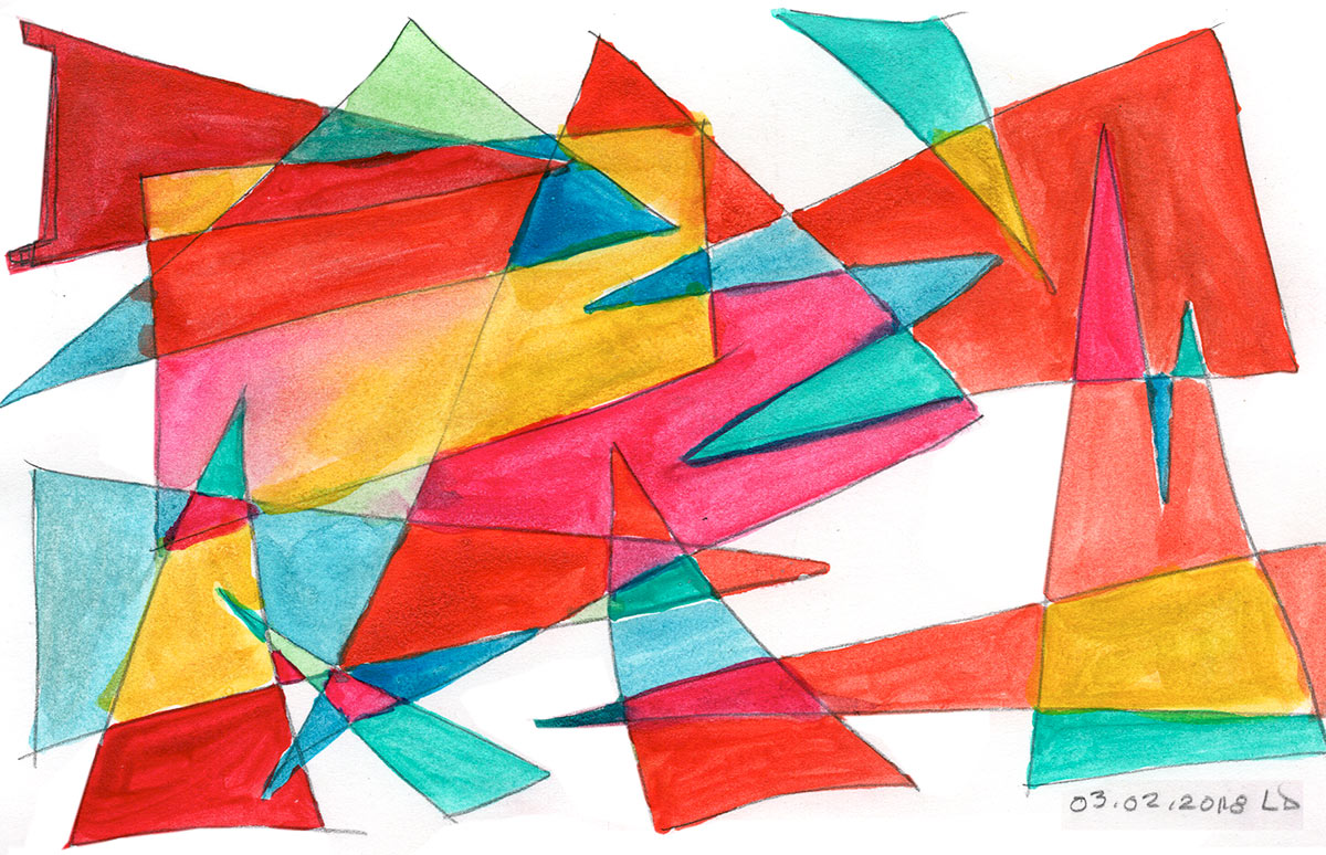
This second composition was rather a departure or experiment that, while some interesting things happened, rather collapsed the visualization of the colors’ transparency. By removing the natural order of color interplay, the whole thing flattened out altogether to the eye. There’s no reason or logic to it.
No doubt had I spent some time on the composition of colors, eg. created some system or logic for it, I could have fooled the eye into believing it, thereby skirting around the ‘natural’ order rather than the resulting chaos. But that sort of thing takes time and trial.
On balance, looking at it now, I can see that a start would have been to’ve left a few key areas as negative space.

Reblogged this on From 1 Blogger 2 Another.
I always enjoy when you share about your creative process; I learn a lot, too. Thank you.
Thank you! Glad to hear more than just me is learning 🙂